Meeting room designs for both in-person and remote participants
Now that small hybrid meetings are commonplace, what meeting room designs work for a mixture of in-person and remote participants?
Read the rest of this entry »

Now that small hybrid meetings are commonplace, what meeting room designs work for a mixture of in-person and remote participants?
Read the rest of this entry »
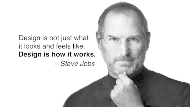 “Design is how it works” is the favorite thing Apple software engineer Ken Kocienda heard Steve Jobs say.
Here’s Steve:
“Most people make the mistake of thinking design is what it [a product] looks like. People think it’s this veneer—that the designers are headed this box and told, “Make it look good!” That’s not what we think design is. It’s not just what it looks like and feels like. Design is how it works.“
—Steve Jobs, The Guts of a New Machine, 2003 New York Times interview
If only we applied Steve’s insight to event design.
Good event design is not just about look and feel. It’s not just about novel venues, decor, food and beverage, and production. Dressing up standard conference process with razzle-dazzle glitz isn’t good event design either.
Good event design is about how a conference works.
This implies that good event design requires thinking about issues like:
You always have a choice. Keep on dressing up the same-old same-old in different clothes. Or think about designing what happens at your events.
Because event design is how it works.
HT to Ken Kocienda for sharing the Steve quote in his excellent book: Inside Apple’s design process during the golden age of Steve Jobs [Page 187]
 Long ago, consultant Tom Gilb coined the term “mythodology” to describe erroneous but commonly held beliefs about how something should be done. Here are nine conference mythodologies.
Reality: No, you don’t. At least half the sessions programmed at traditional conferences are not what attendees want.
Reality: People tend to stay with people they already know at event socials. Participant-driven and participation-rich events provide far more opportunities to meet people you actually want to meet.
Reality: Sadly, conference curators don’t exist. However, discovering the content wants and needs of participants at the event and satisfying them with the collective resources in the room is routinely possible and significantly improves the quality of your conference content.
Reality: Learning is a continual process; formal events only contribute a small percentage to the whole.
Reality: Downtime is essential for effective learning and connection, so providing conference white space is essential. (Trick: Stuff your program if you must, but give attendees explicit permission to take their own downtime when they need it.)
Reality: Novelty is a one-time trick. Next time it’s old. But making your meeting better lasts. Go for better, not just different.
Reality: Better for the owners perhaps (if the meeting is making a profit) but not better for participants. Today’s most successful conferences are micro conferences. (And, by the way, most conferences are small conferences.)
Reality: If you’re using smile sheets or online surveys, you’re learning nothing about the long-term value of your meeting. This is the meeting industry’s biggest dirty secret. Use long-term evaluation techniques [1] [2] instead.
Reality: Sounds silly when put like that, but it happens all the time. Designing your meeting and then choosing a venue that can showcase your design will improve your meeting experience (and can save you big bucks!)
I bet you can think of more than these nine conference mythodologies. Share them in the comments!
Image attribution: Flickr user dunechaser
 What can meeting designers learn from religious services?
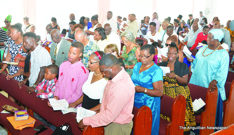
On my daily vacation walk to Island Harbour, I hear singing. As I turn the corner onto Rose Hill Road, the sound swells. It’s 7:30 a.m., but the morning service at St. Andrew’s Anglican Church is in full swing. As I pass, a familiar hymn from my youth washes over me, sung by a hundred enthusiastic voices. And yes, I admit it, as I enjoy the harmonies I hear, I begin to think about religious meeting design. And here’s what meeting designers can learn from religious services
Religious services are probably around 300,000 years old — by far the oldest form of organized meeting created by humans. We know little about prehistory religious services, but the meeting designs used by major world religions today date from the Middle Ages. Over the last thousand years, religious meetings developed some important features in order to maximize the likelihood that people would attend.
What’s interesting is that these features are largely absent from modern secular meetings!
So what can we learn from religious meeting design? I confine my observations to Christian and Jewish services, as they are the faiths familiar to me.
The most frequent preaching length in Christian churches is 20 to 28 minutes. Although some pastors take more time, their number is decreasing. And in 2014, the Vatican recommended that sermons be limited to eight minutes or less!
While people joke about the length of boring sermons, contrast this relative brevity to modern conferences, where speakers typically speak for an hour. We know that listener attention drops sharply after ten minutes unless a speaker does specific things to maintain it. Religious institutions know this and deliver short bursts of emotional content. Most meetings don’t, and attendee learning suffers as a consequence.
Singing is one of the most powerful fundamental, communal human activities; right up there with eating together. The oldest written music is a song, the Sumerian Hymn to Creation, dated before 800 B.C. Communal singing likely predates this by tens or hundreds of thousands of years.
Jewish and Christian religious services are full of singing and praying. These are communal activities — each congregant contributes to a common endeavor. Some people have good voices, sing in harmony, and add pleasure to everyone’s experience. Even those who can’t carry a tune very well become part of something, a common endeavor, while they are singing a familiar and often beautiful hymn or prayer.
Communal activities are powerful because they align participants in a common experience: creating something beautiful and uplifting together. When was the last time you did something like that in a meeting?
Most meeting organizers assume that breaks and socials should provide the majority of human interaction in their meetings. But breaks and socials aren’t communal activities — everyone is doing something different! The post-service Church Suppers and Jewish Kiddish give congregants time to meet socially. This strengthens the communal experience provided by the service. In contrast, modern conferences expect attendees to bond after having primarily listened to lectures.
People don’t sit still at most religious services. They stand to sing and pray. In some congregations, dance is a normal component of the service. Physical movement during events is important because blood flow to the brain starts to decline within ten minutes of sitting still, leading to decreased attention. Sadly, it’s rare for meeting sessions to include any kind of body movement.
Whatever opinions you hold about religious services, it’s clear that they are designed to create an emotional experience. Given a choice between emotional and “book learning” experiences, people will invariably choose the former. Religious services offer the kinds of experiences that people prefer, served up in a safe and familiar way. Most conferences offer little emotional experience directly related to their content and purpose; instead such experiences — entertainment and socials — are glued onto the program as unintegrated extras.
What can meeting designers learn from religious services? I’m not suggesting that we turn all our meetings into gospel revivals. But think about it. How would your meetings be improved if they incorporated some of the religious services features I’ve shared here?
Church service photograph courtesy of The Anguillan
Another issue of an occasional series—Dear Adrian—in which I answer questions about event design, elementary particle physics, solar hot water systems, facilitation, and anything else I might conceivably know something about. If you have a question you’d like me to answer, please contact me (don’t worry, I won’t publish anything without your permission).
Here’s a great question from Australian facilitator, trainer, and coach Steve Rohan-Jones about … The Three Questions! (Check out the link if you aren’t already familiar with The Three Questions. Otherwise, what you are about to read won’t make much sense.)
Good morning from Canberra, Adrian,
I have just read through The Power of Participation over one year after I received a signed copy from you!
In short, I have a question about The Three Questions. I understand the process both in singular and multiple form (combined with round tables). From my reading, The Three Questions appears to take some time (based on the amount of participants) with only one person speaking. This appears at odds with the aim to get people engaged in conversation.
I would also think – not a question just an observation – that group of 6 would be better. This would speed up the set piece of one person speaking and others listening, reduce the need for breaks and keep the energy going early in the day.
Can you clarify my understanding of The Three Questions?
I look forward to hearing from you.
Cheers
Steve Rohan-Jones
O2C Pty Ltd
Steve, I like your question. It highlights a key tension inherent in group process design: the tension between intimacy (going deep with a few) and discovery (uncovering the possibilities of the many). How does group size impact process design? Let’s explore this in more detail.
When people are meeting for a shared purpose, some of the potentially valuable outcomes include:
The Three Questions focuses on #1, #2, and #3. I use it at the start of an event because we can’t learn effectively from our peers (#4) until we:
Because each person gets the same amount of time to share their answers to The Three Questions with a group, the time needed to run the process is proportional to the group’s size. [I’m neglecting here the few minutes needed to a) explain the process and b) provide one or two short breaks for large groups.] In practice, I’ve found this restricts the maximum effective size of a single Three Questions group to 60 people. What if more than 60 people are present? Then you divide them into smaller groups and run multiple simultaneous The Three Questions sessions.
Even if we have 60 people or fewer, we may still decide to divide our group into several smaller groups and run multiple simultaneous sessions. Typically we’ll do this when time is a constraint.
For example, next month I’m leading a two-hour, ~200 person, participation techniques workshop. To cover multiple core techniques in two hours with this many participants, I will give them just a taste of The Three Questions by running 30+ concurrent 6-person groups. Everyone will know five former strangers much better after the ~20-minute session is over, but they won’t have learned more about the others in the room.
So when designing a session or conference that includes The Three Questions, there is a trade-off between the time we have or want to allocate and group size. Why? Because we need to give each person sufficient time for meaningful sharing with their group (typically 1 – 2 minutes per person).
There’s no single answer for this design decision that’s optimum for all circumstances. At a multi-day conference, for example, it makes sense to run multiple simultaneous 50-60 person Three Questions groups for a couple of hours at the start of the event. Everyone in each group will learn important information about the interests and resources of their 50-60 peers. For a monthly board meeting, once a year I might run a single session with the ten board members to remind the group of each member’s “why?”. And at a one-day peer conference with ninety participants, perhaps three simultaneous 30-person sessions would be the way to go.
In some ways this design consideration is a parallel application of Jerry Weinberg’s Law of Raspberry Jam:
The wider you spread it, the thinner it gets.
We are looking for a balance between:
Both intimacy and discovery have their benefits. So how does group size impact process design? By choosing the size of the groups using The Three Questions, it’s possible to select the balance that works for the design and constraints of each unique situation.

Useful knowledge increasingly resides in our social networks, not in our individual heads. Consequently, we are moving from an industrial economy to a connection economy. One which creates value by concentrating on building relationships rather than stuff.
In the connection economy, there’s a dividing line between two kinds of projects: those that exist to create connections, and those that don’t.
—Seth Godin, First, connect
Do you design your conferences for a connection economy or an industrial economy?
Photo attribution: Flickr user ch-weidinger
How can we improve conferences? Well, consider a bucket.
A bucket. A container with a handle. Pretty basic. Unchanged in design for thousands of years.
Until now.
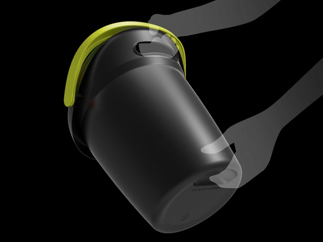
Home Depot hired the design firm Herbst Produkt to design a better bucket. Scot Herbst watched people using buckets and noticed the traditional design was:
So he designed the Leaktite Big Gripper bucket to provide a better bucket experience. The handle has a comfortable molded grip, the lip is shaped to provide a smooth pour, and two added grip pockets make it a cinch to pick up the bucket and pour its contents.
Yet, the new bucket is no more expensive to make than a traditional one. It just works better.
Similarly, it’s not hard to notice that traditional conference designs are:
If we want to improve these aspects of our conferences we need to redesign them. We know many ways to do this—the Conferences That Work format is just one possibility. These redesigns are no more expensive than the old ways. They just work better.
Good meeting design can radically improve your conferences. It’s available now.
Why not add it to your bucket list?
Hat tip to Wired for the story and Brad Wilson for the bad pun.
Photo attribution: Herbst Produkt
Conferences That Work continually evolve.

“Our basic ideas about design have been based on Newton, says Tim [Brown of Ideo]. Design assumes the ability to predict the future based on the present. We need to think more like Darwin: design as an evolutionary process. Design is more about emergence, never finished…”
—From a blog post by David Weinberger about a talk given by Tim Brown of Ideo
The marketing pioneer John Wanamaker reportedly said that half the money spent on advertising is wasted; the trouble is we don’t know which half.
Similarly, there are probably fundamental principles underlying good design of human meeting process. The trouble is, we don’t know what they are. (Beware anyone who claims they have a comprehensive list).
I believe we need to experiment like scientists and artists to discover over time what works and what doesn’t. So that’s why my attempt to share what I learned about running participant-driven events between 1992 and 2009 in my book Conferences That Work: Creating Events That People Love is a frozen-in-time snapshot of the “best” process I knew up to the moment the ninth manuscript draft went to the printer.
Thirty months later, the supplement I started writing within a few months of publication remains an ever-changing work as I continue to experiment and learn at every event. [See the comment below for supplement information.] As a result, printed books are poor vehicles for this kind of information, so I expect to publish the supplement as a continually updated ebook of some kind—but that’s another story.
As a recovering ex-physicist, I love Tim Brown’s description of the old paradigm of design as a Newtonian knowable. Thinking of design, in my case meeting and conference design, as something that is emergent, responsive, and continually evolving is a humbling and yet wonderfully freeing lens to view my work.
Photo attribution: Flickr user raneko
Let’s talk about name badge design.
You look around the room. There’s that guy you had a blast singing karaoke with last year. Uh oh, he’s coming over—what’s his name? Squint at his badge, can’t read it, oops he saw me look, embarrassing.
Sometimes it’s the little details that are important.
Attendees spend large sums of money getting to an event that trumpets, overtly or covertly, the networking opportunities. And then, someone decides to save a buck on the name badges by using “the small ones”, or has them printed using 12-point type.
Not smart.
And yet, Google “name badge design” and you’ll get about 1,810,000 hits, of which two are about design (see my resource list below) and 1,809,998 are selling name badge products.
So I thought it might be interesting to share my current name badge design criteria. Your preferences may vary. But, whatever they are, think about your name badge design; don’t treat it as an afterthought!
What kind of badge?
Please don’t use those “Hello my name is” sticker badges unless your event is informal and lasts a few hours or less. For any other occasion, sticker badges say “tacky, unprofessional.” They will disappear for good when the sweater is put on or removed, and they can’t and won’t be transferred to new garments on the following day.
Just about every other kind of badge can look professional, whether they’re humble common laser or inkjet printed cards in plastic pouches, laminated badges, or fancy badges with magnetic stripes or RFID.
Size
This depends on how much information you’re putting on the badge, but I judge 3½” x 2¼” horizontal badges to be too small, while 4″ x 3″ horizontal badges are acceptable, and 4″ x 6″ vertical badges are my current favorite. The bigger the badge the bigger the type can be, and I think that’s a good thing. And bigger badges are less liable to flip around as attendees move about. The only downside of big badges is—they cost a bit more. I think they’re worth it.
What goes on the badge?
![]()
![]()
Here’s what I like to see on a badge.
Name: First name with a line to itself. Put the last name on the next line.
Affiliation: The company or organization you represent.
Twitter ID: This is becoming increasingly popular. Knowing someone’s Twitter ID allows attendees to find out a lot about them, and encourages interaction and connections via social media during and after the event.
Event identification: Holograms if you need them for security purposes, or a logo or event name if there are other events in the space or you feel you need to shout out to non-attendees why all these people are here.
Badge wearer’s role at the event: Organizer, volunteer, first-time attendee, returning attendee, speaker, panelist, and session facilitator: so many possible event roles. Have a way to indicate them on the name badge.
Schedule on the back: One reason to have a big badge. This isn’t usually practical for a 3+ day event, but if you’ve got the room it’s an extremely useful tool for attendees.
No organization title. Trade show staff won’t like this, but I’m on the side of the attendee here. Yes, I still haven’t forgotten being ignored by trade show staff in favor of the guys with the C-Suite titles on their badges. I’m in favor of event environments that don’t provide this kind of potentially prejudicial information upfront.
Layout and design
I’m not a graphic designer, but people who are (see resources) say that using a sans serif font in a point size large enough so that you can read someone’s name at least ten feet away (try it before you print them all) is the way to go. Sounds good to me. Make the first name the largest, the last name a bit smaller.
Remember, with any badges it’s important to preview them before they’re printed to make sure that long names aren’t truncated. If the badge is small, don’t reduce the font size for everyone to fit a few long names; instead, print those badges separately using an appropriately smaller font.
Make the affiliation and Twitter ID look a little different from the name (different color or different font) and about the same font size as the last name.
Event identification should be as small as possible consonant with the reason(s) you’re adding it to the badge.
The wearer’s event role can be indicated in a number of ways. For example, there are colored ribbons you attach to the bottom of the badge, or you can print the role in a smaller type, usually at the bottom of the badge. One issue is that a small number of people may have more than one role, and it’s good to show this on the badge. But this means you need enough space reserved for the maximum number of simultaneous roles a person may have.
I like to use color to code roles. If your badges are monochrome, one low-budget way to indicate roles is to use colored dots hand-affixed to badges—a little amateurish, but it works well.
If you’re printing a schedule on the back, use a readable font and make it as large as you can without omitting any schedule details.
Method of attachment
Here is my list of attachment methods, in order of least to most preferred.
One or two-sided?
If you don’t print an agenda on the back of your badge, consider duplicating the front there. Then it won’t matter which side shows.
Recyclable
There are badges these days that are promoted as recyclable; the plastic pouches are biodegradable. Frankly, I prefer to collect the pouches at the end of the event and reuse them at future events. A few quick announcements at the conclusion of the event will, in my experience, retrieve 80-90% of the badges used.
Resources
A great article by Mike Davidson on Building a Better Conference Badge.
A short but sweet post by Matt Cutts on the Ideal Conference Badge (lots of good comments).
Jason Santa Maria’s thoughts on badge design.
Two places you can buy magnetic badge holder jewelry are Lisa Bess and Amy T on Etsy.
Conclusion
I am not a name badge guru, just someone who needs event name badges and has opinions. As usual, I hope to learn more about what I don’t know from you, my dear readers. What have I missed? Do you agree with my preferences? Finally, what can you add to improve our collective knowledge of this simple but important part of every conference?
Image attribution for SXSW photo.
Include Pecha Kucha, not Ashton Kutcher, at your next conference!
Instead of going after celebrities to present at your next conference, highlight some stars amongst your attendees with a Pecha Kucha session.
Pecha Kucha is a dynamic presentation format that has spread globally since its invention in Japan in 2003. Think of it as a haiku for presentations. Twenty slides automatically advance, each shown for twenty seconds, while the presenter shares their passion for a topic. Because each presentation lasts just 6 minutes and 40 seconds, presenters are challenged to be concise, targeted, and creative—and you can pack eight attendee presentations into an hour-long conference session.
Oh, you have a question. You want to know how to pronounce Pecha Kucha? Don’t be embarrassed, everybody asks. Just watch this short YouTube video:
It’s pretty easy to set up a Pecha Kucha session. Before the conference, you’ll need to:
Have them send their presentations to you before the session. On the day, you’ll need an appropriately sized location with presentation-friendly lighting, a wireless mike and sound system, a schedule, and a screen, projector, and laptop running PowerPoint or Keynote. Add an MC and a staffer for the laptop and you’re ready to go!
I’m a big fan of Pecha Kucha as a way for people to connect and learn in a fun, fast-paced environment. I’ve just signed a contract to run Brattleboro Pecha Kucha Night, and we’re working on holding a Pecha Kucha session at Event Camp Twin Cities this fall.
Want to learn more? Check out the hundreds of presentations available on the official Pecha Kucha website. (I especially like this one by Daniel Pink on Emotionally Intelligent Signage.) I also recommend you attend a nearby Pecha Kucha Night to experience the format firsthand. You’ll see how Pecha Kucha can liven up any conference.
Have you used or experienced a Pecha Kucha session? How did it work out for you and/or the attendees?