Anatomy of a name badge
Let’s talk about name badge design.

You look around the room. There’s that guy you had a blast singing karaoke with last year. Uh oh, he’s coming over—what’s his name? Squint at his badge, can’t read it, oops he saw me look, embarrassing.
Sometimes it’s the little details that are important.
Attendees spend large sums of money getting to an event that trumpets, overtly or covertly, the networking opportunities. And then, someone decides to save a buck on the name badges by using “the small ones”, or has them printed using 12-point type.
Not smart.
And yet, Google “name badge design” and you’ll get about 1,810,000 hits, of which two are about design (see my resource list below) and 1,809,998 are selling name badge products.
So I thought it might be interesting to share my current name badge design criteria. Your preferences may vary. But, whatever they are, think about your name badge design; don’t treat it as an afterthought!
What kind of badge?
Please don’t use those “Hello my name is” sticker badges unless your event is informal and lasts a few hours or less. For any other occasion, sticker badges say “tacky, unprofessional.” They will disappear for good when the sweater is put on or removed, and they can’t and won’t be transferred to new garments on the following day.
Just about every other kind of badge can look professional, whether they’re humble common laser or inkjet printed cards in plastic pouches, laminated badges, or fancy badges with magnetic stripes or RFID.
Size
This depends on how much information you’re putting on the badge, but I judge 3½” x 2¼” horizontal badges to be too small, while 4″ x 3″ horizontal badges are acceptable, and 4″ x 6″ vertical badges are my current favorite. The bigger the badge the bigger the type can be, and I think that’s a good thing. And bigger badges are less liable to flip around as attendees move about. The only downside of big badges is—they cost a bit more. I think they’re worth it.
What goes on the badge?
Here’s what I like to see on a badge.
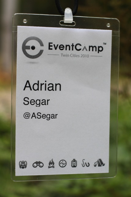
Name: First name with a line to itself. Put the last name on the next line.
Affiliation: The company or organization you represent.
Twitter ID: This is becoming increasingly popular. Knowing someone’s Twitter ID allows attendees to find out a lot about them, and encourages interaction and connections via social media during and after the event.
Event identification: Holograms if you need them for security purposes, or a logo or event name if there are other events in the space or you feel you need to shout out to non-attendees why all these people are here.
Badge wearer’s role at the event: Organizer, volunteer, first-time attendee, returning attendee, speaker, panelist, and session facilitator: so many possible event roles. Have a way to indicate them on the name badge.
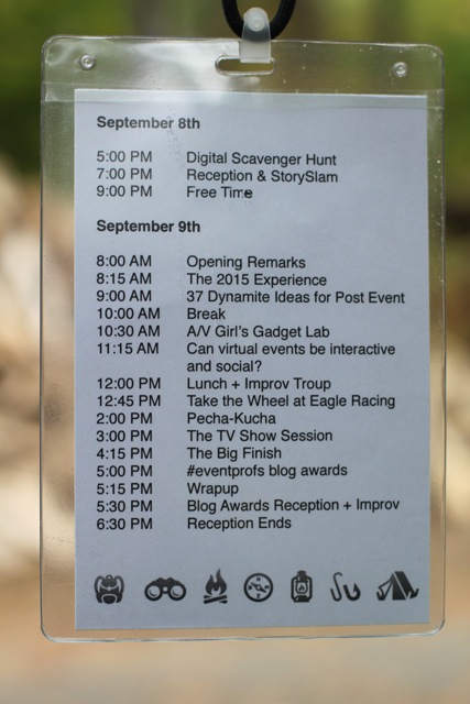
Schedule on the back: One reason to have a big badge. This isn’t usually practical for a 3+ day event, but if you’ve got the room it’s an extremely useful tool for attendees.
No organization title. Trade show staff won’t like this, but I’m on the side of the attendee here. Yes, I still haven’t forgotten being ignored by trade show staff in favor of the guys with the C-Suite titles on their badges. I’m in favor of event environments that don’t provide this kind of potentially prejudicial information upfront.
Layout and design
I’m not a graphic designer, but people who are (see resources) say that using a sans serif font in a point size large enough so that you can read someone’s name at least ten feet away (try it before you print them all) is the way to go. Sounds good to me. Make the first name the largest, the last name a bit smaller.
Remember, with any badges it’s important to preview them before they’re printed to make sure that long names aren’t truncated. If the badge is small, don’t reduce the font size for everyone to fit a few long names; instead, print those badges separately using an appropriately smaller font.
Make the affiliation and Twitter ID look a little different from the name (different color or different font) and about the same font size as the last name.
Event identification should be as small as possible consonant with the reason(s) you’re adding it to the badge.
The wearer’s event role can be indicated in a number of ways. For example, there are colored ribbons you attach to the bottom of the badge, or you can print the role in a smaller type, usually at the bottom of the badge. One issue is that a small number of people may have more than one role, and it’s good to show this on the badge. But this means you need enough space reserved for the maximum number of simultaneous roles a person may have.
I like to use color to code roles. If your badges are monochrome, one low-budget way to indicate roles is to use colored dots hand-affixed to badges—a little amateurish, but it works well.
If you’re printing a schedule on the back, use a readable font and make it as large as you can without omitting any schedule details.
Method of attachment
Here is my list of attachment methods, in order of least to most preferred.
- Sticky badge. No! Enough said.
- Pin. Can be appropriate for formal events, but pin badges are a drag to attach and remove and they invariably don’t look level.
- Clip. Great if you have something to clip them to, but not everyone will: e.g. they don’t work very well on pocket-less tees.
- Lanyard. Yes, they look dorky, but they are easy to put on and remove. Lanyard clips that have some width seem to solve the flip-around problem.
- Magnet. [Update, October 6: Please see Traci’s comment for a warning about using magnetic badges. Having read this, I’m not going to advocate for magnet attachment unless I hear of a safe way to shield the field]. Magnet clips are a bit more expensive than the previous methods, but they work on any clothing and make it easy to position the badge right where you want it. Some people bring their own magnet badge to events and replace whatever they’re given. There are some enterprising businesses that make magnet badge jewelry (see resources).
One or two-sided?
If you don’t print an agenda on the back of your badge, consider duplicating the front there. Then it won’t matter which side shows.
Recyclable
There are badges these days that are promoted as recyclable; the plastic pouches are biodegradable. Frankly, I prefer to collect the pouches at the end of the event and reuse them at future events. A few quick announcements at the conclusion of the event will, in my experience, retrieve 80-90% of the badges used.
Resources
A great article by Mike Davidson on Building a Better Conference Badge.
A short but sweet post by Matt Cutts on the Ideal Conference Badge (lots of good comments).
Jason Santa Maria’s thoughts on badge design.
Two places you can buy magnetic badge holder jewelry are Lisa Bess and Amy T on Etsy.
Conclusion
I am not a name badge guru, just someone who needs event name badges and has opinions. As usual, I hope to learn more about what I don’t know from you, my dear readers. What have I missed? Do you agree with my preferences? Finally, what can you add to improve our collective knowledge of this simple but important part of every conference?
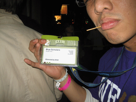
Image attribution for SXSW photo.


