Well, for one thing, this dinner, held annually since 1829, still does not admit women!
“We are a men’s club, do not take this Gendergaga with us. Even the pope would not be invited if he was a woman.” [translation from German] —Patrick Wendisch : Bild.de from January 19, 2019
Maximal intimacy. This is the big one. When I’m eating at a meeting I want to, well, meet people. I can eat alone any time, thank you very much. And if I want to converse with one or two other people, just about any seating configuration will work. But if I’m with five best friends, I want to be able to communicate with them without shouting or straining to hear them. And when banqueting strangers surround me, I’d like to maximize the number of new people I can effectively meet.
Lack of distractions. I can’t meet other people when our conversation is drowned out by emcees, dinner speakers, or (aargh!) “mood” music. Or when a sponsor is displaying a promo movie on every wall in the room.
Comfort. Please don’t make me sit on a cheap plastic chair or a wooden bench with no back support for an extended period while I nosh. It’s cruel and unusual punishment. (Meeting planners usually get this one right.) And if it’s too hot or cold, I’ll be miserable. If we’re going to be dining outside in the Sahara or the Arctic (cool!), let me know in advance so I can dress appropriately.
OK, got that? It’s time for a couple of specific suggestions.
Are you Tortured by Nights of the Round Table?
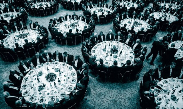
I am. The above link goes into detail, but from my audiologist-swears-my-hearing’s-normal-but-I-don’t-think-so perspective, traditional large rounds for seated meals — a staple of every meeting planner’s banquet design — conflict with criterion #1.
Typically, meals are served at 60″ rounds (eight seats per table), 66″ rounds (nine seats per table), or 72″ rounds (ten seats per table). I start having a hard time hearing everyone at 60″ rounds, and the larger sizes pretty much relegate me to talking with the two people on either side of me (and that’s assuming the table is full — often not the case with unassigned seating.)
If you’re going to use rounds, in my view, smaller ones are better. The problem is that many venues don’t stock them, so you may have to pay extra to use them. Nevertheless, consider using 54″ rounds (7 – 8 seats), 48″ rounds (6 seats), [or even 36″ rounds (4 seats) if your meal service isn’t super-formal]. Everyone is likely to be able to converse with everyone else at the table and maximal intimacy is yours!
The Fable of the Communal Table
Until relatively recently, most public dining occurred communally because only the rich could afford private dining rooms and there were far more poor folks around. Then we got hoity-toity and invented restaurants and conferences.
About ten years ago, communal tables started creeping back into restaurants. Some argued that this trend met a desire to return to a dining environment with greater “community”. The more cynical noted that establishments could now cram more people in the same space by seating them at long rectangular tables next to strangers.
While I think communal tables are great if they’re an integral part of an authentic cultural meal where dining involves lots of moving about — e.g. as pictured below, the deliciously messy outdoor calçotada I enjoyed in Catalonia last year — at traditional conferences they are poor places to converse with others.
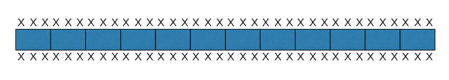
So, if you’re using rectangular tables, don’t do this:
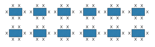
Instead, do this: But wait, there’s more…
Sorry, I’ll admit that this is not everything you need to know about seating while eating at meetings. But it’s a start, and, like Jude, you can make it better. Please feel free to add your contributions in a comment below.
Picture of Jesus with the Eucharist at the Last Supper by Juan de Juanes – [2], Public Domain, Link calçotada image by David Benitez
Here are six ways to keep attendees comfortable and improve your event. While stuck in cramped seats during a six-hour Boston to San Francisco flight, my wife gently pointed out that I had become quite grumpy. She helped me notice that my lack of body comfort was affecting my mood. Luckily for me, Celia remained solicitous and supportive, reducing my grouchiness. Once we were off the plane my spirits lightened further.
Unfortunately, I tend to be oblivious for a while to the effects of physical discomfort on my feelings. Until I notice what’s really upsetting me, I typically and unfairly blame my irritability on innocent culprits, for example:
The tediousness of gardening because insects are swarming around my head.
The delay in waiting for my food to arrive in a noisy restaurant.
A presenter’s inability to capture my full attention while I’m sitting with my neck twisted permanently towards them in an auditorium.
I suspect I’m not alone in these errors of judgment. Pivoting to the world of events, this means if we want to give attendees the best possible experience, we need to minimize the quantity and severity of physical comfort issues that are under our control.
Here are six ways to keep attendees comfortable and improve your event. I’ll share common mistakes you’ve probably experienced, together with suggestions for mitigating their impact.
1 — Room temperature
It surprises me that many venues still can’t get this right. While I know that there’s no such animal as an ideal room temperature for everyone, the fluctuations I’ve routinely seen when rooms empty and fill during an event are often extreme and unacceptable.
There are two issues here.
First, sweltering or freezing rooms make it almost impossible for attendees to concentrate on what’s happening in the session. This is a fixable venue issue; an adequately sized and controlled HVAC plant will maintain the temperature in an acceptable range during normal changes in occupancy.
Second, if the room occupants decide that the temperature should be raised or lowered, the organizers and venue should have procedures in place to make this happen quickly. Why venues continue to distrust their customers and lock up thermostats so only hard-to-summon staff can make an adjustment (and then disappear again) baffles me. If they’re worried that clients will turn the temperature way up or down and leave the room, wasting energy, they should invest in motion detector technology that resets the room temperature when no one is in it.
2 — Noise
Along with 20% of the U.S. population, I have some hearing loss; background noise makes it challenging to hear what’s going on. As a result, playing house music during conference breaks and socials is more than a distraction; it actively impedes the utility of the event for me. (If I want to listen to music, I’ll pick my own and listen elsewhere, thank you very much.) At traditional events where most of the networking occurs outside the meeting sessions, unnecessary noise is at best a distraction and at worse a reason to leave.
Another mistake that is often avoidable is to hold multiple small groups in spaces with poor acoustics. This prevents each group from concentrating on its own conversation because of continuous interruptions by talking/laughter/applause from neighboring groups.
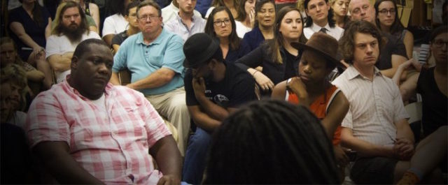
3 — Seating
In 2017, I facilitated Haute Dokimazo, a cool one-day conference held in The Thinkery, a children’s museum in Austin, Texas. The event was a big success, but during the closing group spective the seating was criticized. Yes, as you might expect, some of the chairs were kid-sized. This took a toll on participants’ rear ends over the day!
Even when a venue is designed for adult use, the quality of seating and poor seating layouts (1, 2) can seriously affect participant comfort. The former is a venue or production responsibility. The latter is easy to fix if you know how to set seating for maximum comfort and function.
4 — Safety
We’ve all suffered through awkward “icebreakers” that fail to introduce attendees meaningfully to each other and have no connection to desired meeting outcomes. Providing the right level of emotional comfort at an event is tricky because our best learning often occurs when we feel safe enough to take some smart risks. There are many ways to maximize learning and connection by enhancing participant safety at an event. Some of them are described here.
5 — Breaks
Have you ever felt exhausted while attending a conference, unable to properly concentrate, learn, or participate fully?
I have — and I bet you have as well.
Conference organizers often try to cram too many sessions into the time available. Attendee comfort subsequently declines, along with the quality and effectiveness of the event. It’s not hard to create meeting schedules that include sufficient downtime. If you feel compelled to squeeze everything possible into an event, tell attendees upfront what you’ve done and give them explicit permission to take breaks whenever necessary.
6 — Movement
Think about the meetings you’ve attended with lots of purposeful activity. What was your energy level like, compared to similar meetings where you sat and listened to people speak all day? Did you feel more energized, more on top of what was going on, less tuned out? Most people do.
So, these are my six suggestions to keep attendees comfortable and improve your event. Think about the amount of energy, money, and time that goes into producing and attending an event. Doesn’t implementing as many as possible of the simple suggestions above make excellent sense? You can doubtless think of other ways to improve attendee comfort — for example, streamlining registration and check-in. I welcome your additions in the comments below.
How do room sets imply and influence what happens at meetings? Can room sets affect the quality of democracy, sharing, and equality experienced by participants?
So what can we learn about meeting room set design from Parliament? Here are a few observations.
Curved theatre seating dominates
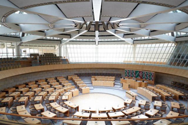
One of the interesting findings is that the most common legislative room set is one rarely used at traditional meetings: the semicircle.
National Assembly, Palais Bourbon, Paris, France
This echoes the pleas that Paul Radde & I have made for years for meeting planners to replace straight-row theatre seating with curved-row designs: pleas that, despite persuasive arguments, have largely fallen on deaf ears. Because every seat directly faces the focal point of the room, curved sets offer maximum comfort for each audience member. People don’t have to continually twist their bodies when they’re sitting for a long period.
Clearly, many architects of legislative chambers know something that most meeting planners don’t.
Room sets correlate with the level of democracy
Every room set imposes an architecture of assembly. Legislatures are meeting spaces that concentrate on sharing points of view, convincing others, making public political statements, negotiation, and compromise. Though all these objectives can be present for the non-political meetings and conferences that make up the majority of meeting industry work, let’s concentrate on the first activity: sharing points of view.
Parliament finds that classroom-style sets “…where members of parliament sit in regimented rows focused on a single speaker… [are] particularly common in countries with a low rank on the Economist’s Democracy Index.” Sadly, classroom sets are still, in my experience, the most common room sets used in meetings. If sharing points of view, participation, and engagement are desirable at a meeting, such sets should be avoided.
Conversely, circle seating is rarely used in parliaments or meetings. Only nine parliaments in the world meet in this setting.
The Landtag in Düsseldorf, the regional parliament of Nordrhein Westphalia in Germany
Circle room sets are the most egalitarian architecture, though hierarchy can still be suggested or maintained if two or more concentric circles of chairs are used. I often open the Conferences That Work meeting design with participants sitting in a single circle of chairs — a room set limited, in practice, to around sixty people.
Horseshoe sets can facilitate a fluid focus
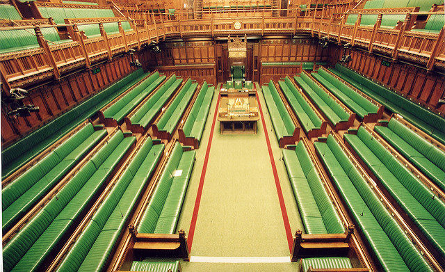
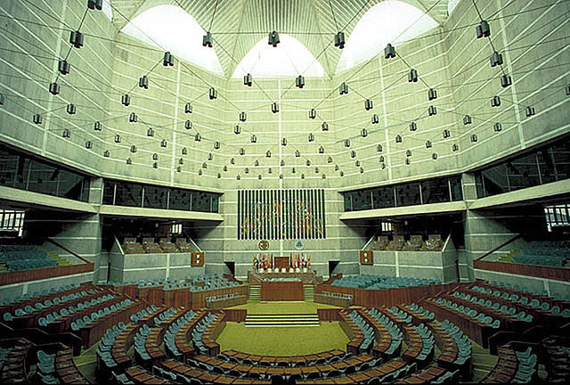
Horseshoe sets are, at first glance, a mixture of the semicircle set above and another common parliamentary form: opposing benches.
Opposing benches in the United Kingdom House of Commons Chamber
Interestingly, I’ve found that horseshoe room sets with a single row of chairs, or multiple rows with plentiful aisles, can provide an effective format for group discussions, with participants moving to and from a few “speaking” chairs at the mouth of the horseshoe.
The Bangladesh horseshoe-form legislative chamber
Meeting professionals are fortunate — if we apply ourselves
Here’s how Max & David conclude their Washington Post article:
“[Architecture] can be one way to … experiment with new models that are more attuned to contemporary life and to the challenges that we are facing today.”
Legislative chambers are massive formal structures that reflect the sociology, history, and politics of their culture. They are rarely rebuilt to reflect changes in the circumstances and outcomes they were originally designed to serve. Even so, the variety of forms displayed in Parliament shows us some of the rich possibilities available, even in heavily constrained circumstances.
Meeting professionals are more fortunate. We can usually change the room set to respond to the specific needs of a meeting. Yet too often, we limit ourselves to a small set of familiar forms we have experienced over and over again.
We can and should do better.
Room set and Landtag images reproduced from The Washington Post French National Assembly image by Richard Ying et Tangui Morlier (Own work) [CC BY-SA 3.0, via Wikimedia Commons House of Commons image attribution Flickr user uk_parliament Jatiyo Sangshad Bhaban, Dhaka, Bangladesh by Rossi101 at English Wikipedia, CC BY-SA 3.0
There are right and wrong ways to set theater seating.
Whenever I see a room set that fights the body, my neck and hips start to ache in sympathy. People shouldn’t have to keep themselves twisted constantly in one direction while seated at an event. Yet we make our attendees do this all the time.
One time, I visited Boston’s Mother Church Extension of The First Church of Christ, Scientist, and shot this panorama of the magnificent 3,000+ seat sanctuary. Designed more than a century ago, the theater seating here is done right. Every seat faces the key focal point in the room: the world’s eighth-largest pipe organ, with a total of 13,295 pipes. Short pews, interspersed with plentiful aisles, make it easy for worshipers to get to and from their seats.
Doing theater seating wrong
Compare the above great design with these contemporary auditoria and event seatings.
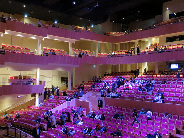
Salle Henri Dutilleux auditorium, completed in 2012
Here’s a concert auditorium in Amiens, France. Pity the concertgoers sitting in the side wall seats who have to turn their heads 30-45 degrees to see the stage. The folks in the seats on the left and right-hand sides of the front-facing seats don’t fare much better. Notice also the long, unbroken center rows of seats—not much fun to get out of during intermission.
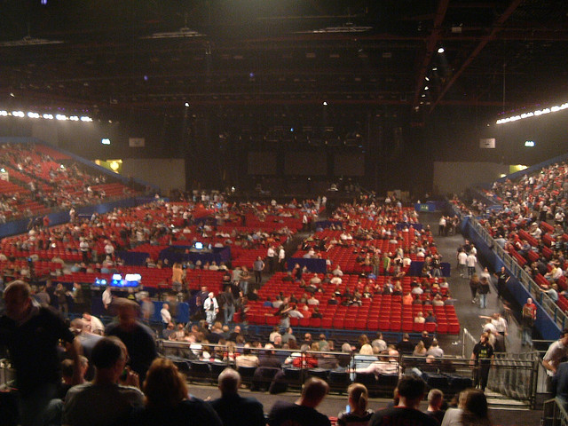
National Exhibition Center
This concert seating set in Birmingham, England, would work well if the stall seating (red center seats) was where the action was taking place. But no, everyone’s supposed to be watching the stage at the far end! Those poor spectators in the tiered seats, sitting at right angles to the action. I don’t know if the tiered seating is removable—if it is it would be much better to set the stage on the long edge of the room and curve the seating around it.
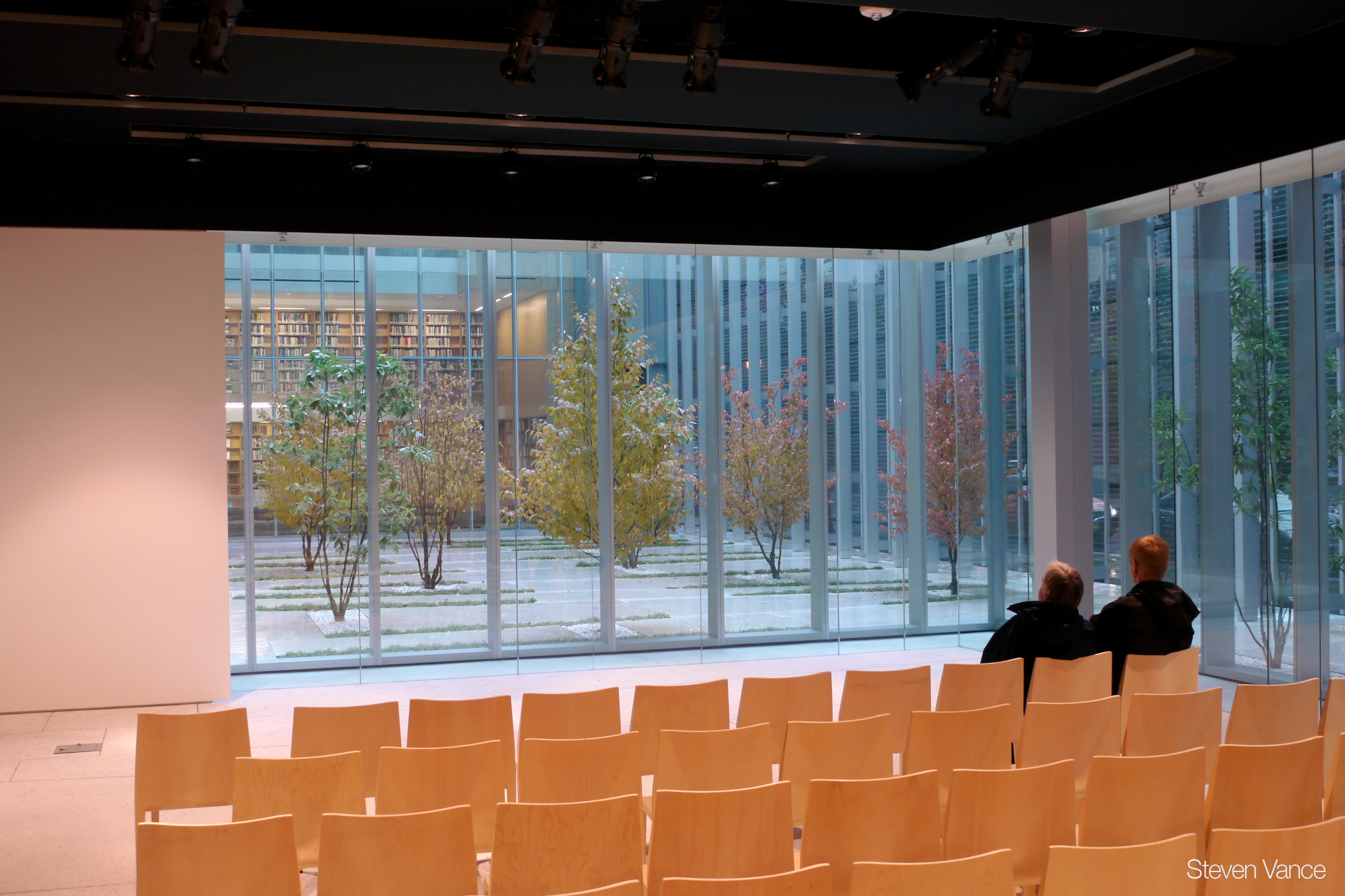
Finally, here’s the Poetry Foundation auditorium in Chicago. An attractive room, but why are the chairs set in straight lines? Curve them around the poet for a much more intimate atmosphere.
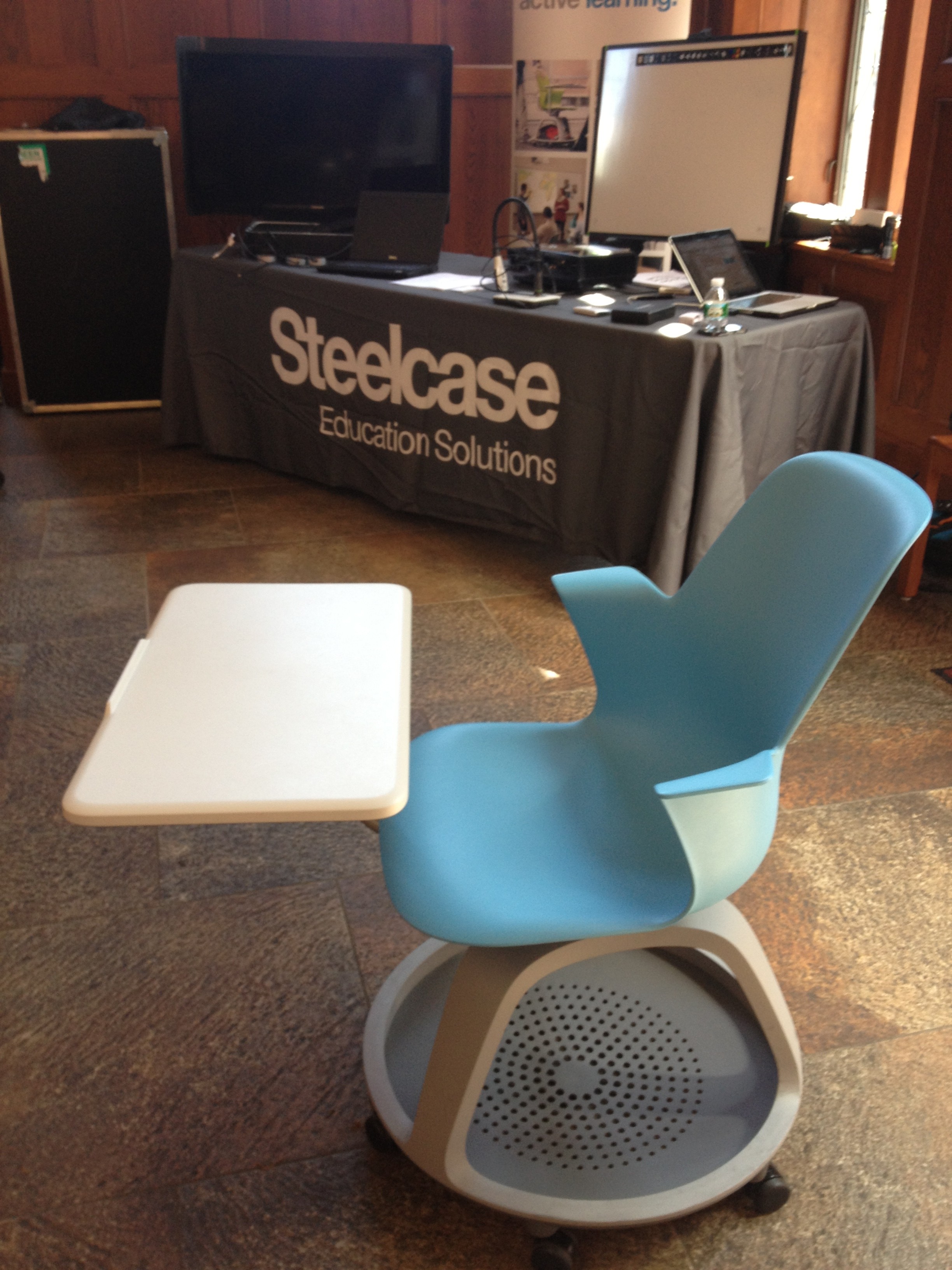
Steelcase’s Node chair, photographed at edACCESS 2013
Ask meeting attendees what’s most important about the chairs they sit in at an event and they’ll inevitably say they should be comfortable.
Ask meeting venues what’s most important about the seating they choose and they’ll probably say cost (though stackable and lightweight will be mentioned too).
If you ask meeting designers like me…what would we say?
A head-turning moment
In 2013 I facilitated the world’s oldest peer conference: the four-day edACCESS annual conference that’s been running since 1992. The conference always includes a small tradeshow, and that year Steelcase was there.
Steelcase is an interesting and unusual company. After a hundred years in business, it’s the world’s largest manufacturer of office furniture. Rather than resting on their laurels, the company’s management is continually looking for genuinely useful and innovative ways to improve business environments. As an illustration, take a look at the Steelcase blog, which is written by top management rather than junior PR staff.
Steelcase wanted to show several lines of products designed for educational environments at edACCESS 2013. That’s where I discovered their Node chair,designed by IDEO and pictured above. I first noticed and liked the tripod storage platform under the chair—a great place to store bags and backpacks off the floor. But then I saw the chair had casters. And when I sat in it, I found out that the seat swiveled. “So what?” you may ask. Read on!
Moveable chairs
Adjustable office chairs were invented in the 1850s and became common in offices during the 1940s. While office workers have long enjoyed the benefits of these chairs, they are rarely seen in conference settings. A quick web search for meeting chairs turns up hundreds of images of rigid plastic stackable chairs that attendees have uncomfortably endured for years.
When you’re sitting in a traditional conference chair, you face the front of the room and can only look elsewhere by turning your head and body as much as your chair allows. Looking anywhere but straight ahead becomes uncomfortable after a few minutes (see Paul Radde’s Seating Matters: State of the Art Seating Arrangements for more information on this). A swiveling chair like the Node makes such shifts of attention easy.
Swiveling makes conference chairs better.
A chair with casters allows participants to quickly move between seating sets. For example, a session might start with a ten-minute presentation, with chairs facing the presenter, and then require small group discussions. Attendees can scoot their chairs into the right formation; no standing or lifting is required. The Node makes this safe by having a tripod construction with a wide base of support, unlike standard office chairs that can tip fairly easily if moved too quickly.
Room to move
“You gotta give me ‘Cause I can’t give the best Unless I got room to move” —John Mayall
While the Node chair gives participants “room to move,” it’s not perfect from a venue’s standpoint. There’s no way to stack Nodes, and their unit cost of $600+ will make most venues’ financial managers blanch. But this kind of seating is what we need if we’re going to transition at our events from the outdated lecture formats of the past to the interactive, engaging, connection-making, community-building conferences of the future, and I salute Steelcase for having the vision and the commitment to improve seating options for the education and meetings markets.
Do you use round tables (aka “rounds”) at your events? Then it’s time to talk about the Nights of the Round Table. Read on, prithee!
A medieval fantasy
Sadly, it’s not clear that King Arthur’s famous Round Table ever actually existed, let alone King Arthur himself. But let’s succumb to a romantic fantasy for a moment (or longer if you like) and assume that there really was a Round Table that looked like the picture above, and you were one of these fabulously clothed dudes hanging out on blocks that were de rigueur for luxurious seating in the 5th century.
How would that work for you?
For me, the “chair” would get to be annoying after a while, but what would really exasperate me would be that I’d only be able to talk to the Knights immediately to my left and right.
All those fascinating Knights of the Round Table. What wonderful stories they could tell! But I’m stuck with talking to just two of them for the whole banquet. Bummer!
Using rounds at events
Back to the present day.
What are round tables about and why do we use them? Well, a round table has no head, implying equal status to everyone who sits there. This is an ideal table shape for pick-your-own seating—no jockeying for the high-status “head” of the table—and everyone faces everybody else as much as possible, given the laws of geometry. As a result, round tables are optimum for small group work when tables are needed (see below).
The larger the table, the more people you can seat around it, but the farther people are from each other. The right table diameter depends on the number of people in each group. Unfortunately, round tables that are too large are often used at events. In practice, once you’re seated at a table that’s more than 54″ in diameter you need the hearing of a teenager, advanced lip-reading ability, or a working Cone of Silence to hear everything that’s going on.
Tables that are larger than needed will reduce the intimacy of the group, so choose the optimum group size and arrange for the correct size rounds in advance, as shown in this table (green is good):
The optimum number of seats versus table size
Table diameter
Optimum number of seats
36”
4
48”
6
54”
7-8
60”
8
66”
9
72”
10
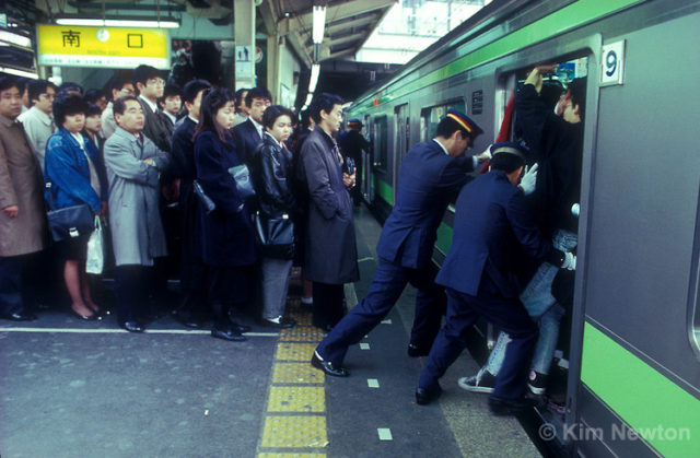
It’s hard to make a strong case for large round tables. In my experience, group work that requires a table is less effective with group sizes larger than 8. And, using the industry standard formula, a 72″ table requires at least 12.1 sq. ft. of room space per person; a 48″ table requires 13.5 sq. ft. If you’re cramming people in so tightly that this difference is important, perhaps you’d enjoy a ride on the Tokyo subway.
As a 70+-year-old starting-to-go-deaf guy, I find that 60″ tables provide a sub-par conversational experience. I strongly recommend not using group discussion tables larger than 60” for multiple table room sets, because they make it difficult for many people to hear those sitting across the table, even if the room has exceptional sound-deadening acoustics and the tables are spaced more widely apart than normal.
Do you even need tables at all?
Seating people at round tables makes sense if they’re going to:
Eat formally in the same room and there isn’t the time and money to change the room set.
Participate in certain kinds of group processes like The Solution Room or World Café where the table—covered with paper—is used as a place to document issues and ideas.
That’s it! Under any other circumstances get rid of the tables! They place an unneeded barrier between attendees, reducing intimacy and connection. And once they’re gone, it’s easy for session participants to quickly reconfigure the room set themselves to switch between, say, curved theatre seating, small group circles, and fishbowl layouts.
This discussion is tabled
Meeting planners; don’t make people suffer through another 1001 tortured Nights of the Round Table. Keep your round tables small, or eliminate them and your attendees will benefit.
Surprisingly, many conference venues do not provide floor plans with room measurements for meeting planners. On a recent round of site visits, only one of the seven facilities visited had this information readily available. Four of the venues had floor plans but supplemented them with infuriating capacity charts showing the number of seats available for classroom, theater, banquet, boardroom, hollow square, etc. sets. (Please, venue sales managers, read Paul Radde’s refreshing book “Seating Matters” and realize that these room sets are not optimum for most circumstances.)
For event designs such as Conferences That Work, where room sets include large circles, horseshoes, table-less small group rounds, and other configurations, I must have the basic room dimensions in order to plan what can happen where.
As a result, a twenty-five-foot tape measure has been part of my site visit kit for many years. This tool, while cheap, is awkward to use. Ideally, you need two people, holding each end, stretching out the tape, and moving multiple times to measure a large room.
A favorite site visit tool
So I was delighted to discover a modern tool that’s ideally suited to rapidly measure room dimensions, the Bosch DLR130K Distance Measurer, as shown above [Update May 6, 2017: The DLR130 model has been discontinued; the newer Bosch GLM 35 looks great too!]. The DLR130 unit uses a laser to measure distance. The DLR130K is a kit that includes the unit, a belt pouch, and four AAA batteries.
This little gem is smaller and lighter than my 25′ tape measure. In about a second, it measures distances up to 130′ [40 m.] within 1/16″, not that I need anything that accurate. By standing in the middle of a really large room and measuring the distances to the opposite walls, you can handle room dimensions up to 260′. The unit will calculate area and volume too if, for some reason, you need to. The batteries are claimed to last for 30,000 measurements.
The DLR130K costs around $90 [Update May 6, 2017: The newer GLM 35 sells for $70 without a case]. A high-quality 25′ tape measure costs around $20, so this is a more expensive tool. I think it’s worth it.
Perhaps one day, every venue sales manager will supply room dimensions (I can dream). Until then, I’m bringing my new favorite site visit tool with me on every site visit.
Unfortunately, 1984 turned out like 1884 in the realm of education.
‘While going about my day, I sometimes engage in a mental exercise I call the Laura Ingalls Test. What would Laura Ingalls, prairie girl, make of this freeway interchange? This Target? This cell phone? Some modern institutions would probably be unrecognizable at first glance to a visitor from the 19th century: a hospital, an Apple store, a yoga studio. But take Laura Ingalls to the nearest fifth-grade classroom, and she wouldn’t hesitate to say, “Oh! A school!”
Very little about the American classroom has changed since Laura Ingalls sat in one more than a century ago.’ —The 21st-Century Classroom, by Linda Perlstein
In her Slate article, excerpted above, Linda Perlstein, an education writer, muses about the effects that school classroom layout and design affect the learning that takes place. She even asks her readers to submit their “best ideas for transforming the American school”. She conflates this request with “asking you to describe or even design the classroom for today, a fifth-grade classroom that takes advantage of all that we have learned since Laura Ingalls’ day about teaching, learning, and technology–and what you think we have yet to learn”.
I think that Linda’s emphasis on transforming the physical learning workspace as the answer to our educational system’s woes focuses on the wrong issue.
Certainly, most modern school classroom layouts have changed very little from Laura Ingalls’ day. But this is a symptom of the lack of change in educational circles, not a cause. It’s often easy to alter the physical layout of a learning space simply by changing the furniture or rearranging it. (Get rid of those chairs with individual writing areas shown above!) And, see Paul Radde’s Seating Matters for a comprehensive introduction to this topic.
Why schools don’t redesign their learning spaces
The reason why schools don’t redesign their learning spaces is because the traditional all-chairs-face-the-front approach mirrors the teaching style perpetuated by our culture for the last 1,500 years. We get classroom layouts that optimize our teaching paradigm. Changing the classroom’s physical design and hoping that our learning environment will somehow improve is a great example of wishing that the tail would wag the dog.
First, change how we teach and how we expect to learn. Then, the need to change our physical educational environment will become pretty obvious. Laura, please use your considerable journalist skills to explore how we do and don’t learn effectively. Publicize what you find—we’ll all be the beneficiaries!
And then perhaps 2084 won’t look like 1984.
Do you think that changing our physical learning environments is the way to improve how well we learn? Or do you think that changing the ways we learn will lead to fundamentally different learning environment designs?
Image attribution: Flickr users buttepubliclibrary and dcjohn

 It’s no
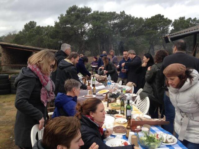
 While stuck in cramped seats during a six-hour Boston to San Francisco flight, my wife gently pointed out that I had become quite grumpy. She helped me notice that my lack of body comfort was affecting my mood. Luckily for me, Celia remained solicitous and supportive, reducing my grouchiness. Once we were off the plane my spirits lightened further.
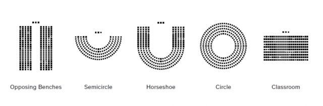
#/media/File:Panorama_de_l%27hémicyle_de_l%27assemblée_nationale.jpg)


![[2]](http://www.museodelprado.es/uploads/tx_gbobras/P00846.jpg)