I get some of my best ideas from my clients. (That’s because consulting—when I listen well—is a two-way street!) So I wasn’t surprised when, during a recent debrief, a client mentioned a simple way to improve the human spectrogram maps I’ve recommended and run for decades.
One of the most valuable tools I use liberally at the start of peer conferences is a variety of human spectrograms, also known as body voting. There’s no quicker and more entertaining way to publicly uncover vital information about who’s in the room. [For a full description of the why, when, how, and tremendous range of this tool, check out Chapter 33 of my book: The Power of Participation.] While I frequently use certain spectrograms, such as experience lines and spectrogram maps, I always tailor them to the specific wants and needs of the participants.
For example, in 2020, I worked with several hundred cardiologists and used two-dimensional body voting to reveal the group’s mix of professional roles (clinical, research, and education) and research types (population, clinical, basic). This allowed the cardiologists to quickly connect with peers who shared similar professional backgrounds. Later, we ran a one-dimensional human spectrogram to explore opinions about the question: “What is the best heart-healthy diet? Plant-based versus omnivore?”. (Fun fact: cardiologists disagree!) We then set up a debate on the topic.
While I primarily work with peer groups, like association members or communities of practice, when the client is a single organization, human spectrograms can be used in a different way.
Using human spectrograms at in-house events
Most organizations have an organizational chart that defines roles and formal relationships:
“The organization chart is a diagram showing graphically the relation of one official to another, or others, of a company. It is also used to show the relation of one department to another, or others, or of one function of an organization to another, or others. This chart is valuable in that it enables one to visualize a complete organization, by means of the picture it presents.” —Organizational chart, Wikipedia
At the start of an in-house event, a human spectrogram can be a powerful way to reveal the formal structure of the organization. There are a few exceptions:
Small organizations where participants already know everyone.
Otherwise, an organizational chart human spectrogram provides several immediate benefits:
Allows participants to “put a face” to colleagues they may not have met, or have had little contact with.
Makes visible the size and scope of different departments inside the organization.
Uncovers the “shape” of the organization, such as the depth of hierarchies and the relative distribution of leaders, middle management, and other employees.
To facilitate the organizational chart human spectrogram, define a physical dimension in the room: “Leadership by this wall, subordinates towards the opposite wall.” You can then guide participants to form the spectrogram either top-down (leadership first) or bottom-up. The former is usually more efficient, while the latter allows for a more relaxed pace as people find their place and become aware of other participants.
If some employees will be absent, consider providing signs or cards with their names to install appropriately in the spectrogram.
Once the human spectrogram is complete, a good facilitator can leverage it in various ways, depending on the meeting’s goals and objectives. For example, you could:
Explore potential departmental reorganizations.
Uncover communication gaps within the organization.
Reflect on staffing levels.
Obtain feedback on outstanding issues and brainstorm solutions.
Given the variety of possibilities, such work should be carefully planned before the meeting.
Conclusion
I’ve only scratched the surface of how to apply human spectrograms to in-person meetings. Hopefully, you’re convinced that an organizational chart human spectrogram can be an insightful starting point for exploring an organization’s dynamics and addressing key issues.
Have you ever used an organizational chart human spectrogram? Share your experience in the comments below!
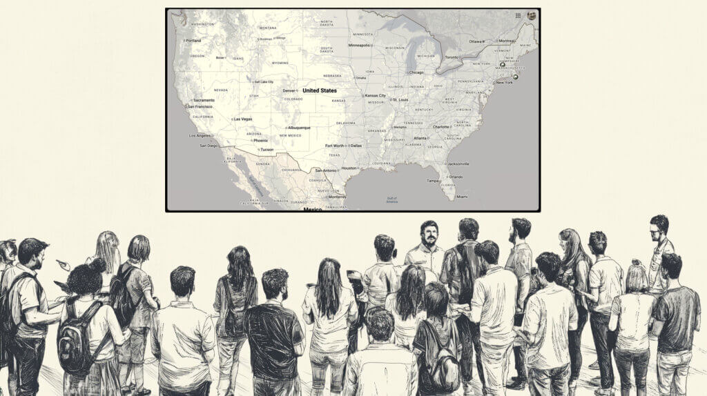
Whenever I open a meeting I run a human spectrogram map, allowing participants to quickly discover everyone at the meeting who lives (or works) near them. This is one of the most useful things you can do for a group of people who don’t know each other — and it only takes a few minutes!
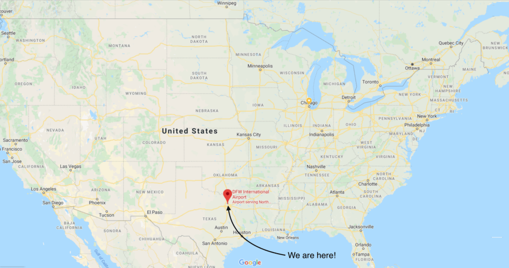
A basic human spectrogram map
The resources for a human spectrogram map are simple: a projected map of the geographic region where the majority of participants live, with the current location marked, and enough clear space in the room for participants to move around easily.
To run a map spectrogram, stand in your room’s clear space in a spot facing the map, positioned in the room so that you mirror the position of the venue marker on the map. If you are using the spectrogram to show where people live or work, say something like the following:
“Let’s find out where everyone [lives/works]. OK, this direction [point, usually from where you’re standing toward the projected map] is north, and where I’m standing in the room is [the location of the conference], so if you [live/work] around the corner you’ll stand right next to me. Here’s a map of [the conference region/country/continent] for the geographically challenged, like me. Please move to stand where you [live/work]. You’ll need to talk to each other!”
If there are major cities or landmarks nearby, it’s helpful to point to where they would be represented in the room. On a map of a country, like the U.S.A. map above, I point to the places in the room representing regions: e.g., “There’s New England, where I’m from, Florida’s over there, Minneapolis is in that direction, and California’s to my left.”
Wait while people determine where to stand. Once most people seem to have found their right location, ask them to introduce themselves to each other and give them some time to do so.
It’s hard to stop the hubbub of conversation that results! Notice anyone who’s standing at the edges of the room (i.e. they live/work outside the map region), ask them where they’re from, and announce it to the group. Also, notice anyone who’s standing alone and encourage them to meet their nearest neighbors.
Map variations
You can adapt this simple spectrogram to specific needs. If you’re exploring how much participants have moved over, say, the last twenty years, you can do a state-change spectrogram by asking people, at your signal, to move to where they lived twenty years ago. Or you can ask them to walk continually between where they work and where they live.
I once ran a map human spectrogram in Abu Dhabi, where most of the workers are not local. When I projected the original map of the United Arab Emirates, we found that everyone at the meeting was living in either Abu Dhabi or Dubai. But when I asked people to move to their country of origin, everyone moved to different places at the edges of the room. I went round and asked the different groups to announce their countries of origin, and then gave them time to discover their birthplace companions.
New ideas I haven’t tried (yet)
One thing I’d love to try at a large venue is to project the map on the floor. Wouldn’t that be great! Perhaps some of the A/V experts who read this blog can share how feasible this is.
Another idea would be to run a map spectrogram in a large room during a social and set up state and/or city tables with pole signs where food and beverages are served. You could use the attendee list geographic data to predetermine the numbers of tables, their sizes, and locations.
Conclusion
Whenever possible, make sure you include a human spectrogram map early in your meetings. Your attendees will thank you!
Do you use human spectrogram maps? Do you have ideas on how they can be improved? Share your thoughts in the comments below.

 I get some of my best ideas from my clients. (That’s because consulting—when I listen well—is a two-way street!) So I wasn’t surprised when, during a recent debrief, a client mentioned a simple way to improve the human spectrogram maps I’ve recommended and run for decades.
 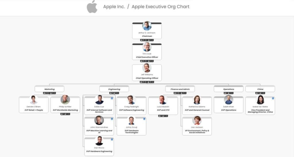 One of the most valuable tools I use liberally at the start of peer conferences is