
 I get some of my best ideas from my clients. (That’s because consulting—when I listen well—is a two-way street!) So I wasn’t surprised when, during a recent debrief, a client mentioned a simple way to improve the human spectrogram maps I’ve recommended and run for decades.
Here’s an outline of the procedure I’ve traditionally used to run a human spectrogram map. (See the link above or Chapter 33 of The Power of Participation for a full description.)
Basic human spectrogram maps
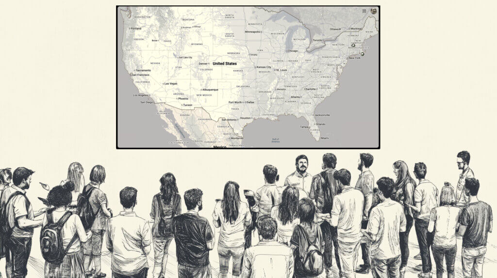
“Let’s find out where everyone [lives/works]. OK, this direction [point, usually toward the projected map] is north, and where I’m standing in the room is [the location of the conference]. So if you [live/work] around the corner, you’ll stand right next to me. Here’s a map of [the conference region/country/continent] for the geographically challenged—like me! Please move to where you [live/work]. You’ll need to talk to each other!”
“There’s New England, where I’m from. Florida’s over there, Minneapolis is that way, and California is to my left.”
A simple improvement of human spectrogram maps
I couldn’t attend my client’s peer conference in person, so I trained her online to facilitate the three-day event. Beforehand, we selected several opening human spectrograms to help the (US-based) participants quickly learn about each other and gain useful, community-specific content for the event’s medical focus. One of these was a human spectrogram map to connect attendees with those who lived near them.
During our post-event debrief, my client casually mentioned that the spectrogram facilitator had spontaneously introduced a simple tweak to the process above. Rather than pointing to locations in the room that corresponded to regions on the map, the facilitator asked participants from each region to walk with him to their spot.
“Who here lives in the Northeast US? Come with me!”
He repeated this process for different regions, physically guiding people to their locations rather than directing them. Instead of telling them where to go, he showed them.
This is a small but elegant improvement —especially valuable because we typically run these spectrograms at the beginning of an event, when attendees are still getting oriented. Gently shepherding folks to their places in the room reduces confusion and increases their sense of safety and support.
Why this matters
Incremental improvements like this may seem trivial. But they matter. They exemplify a focus on “next practices”—refinements driven by thoughtful attention to context— rather than a relentless search for the elusive “best practice”.